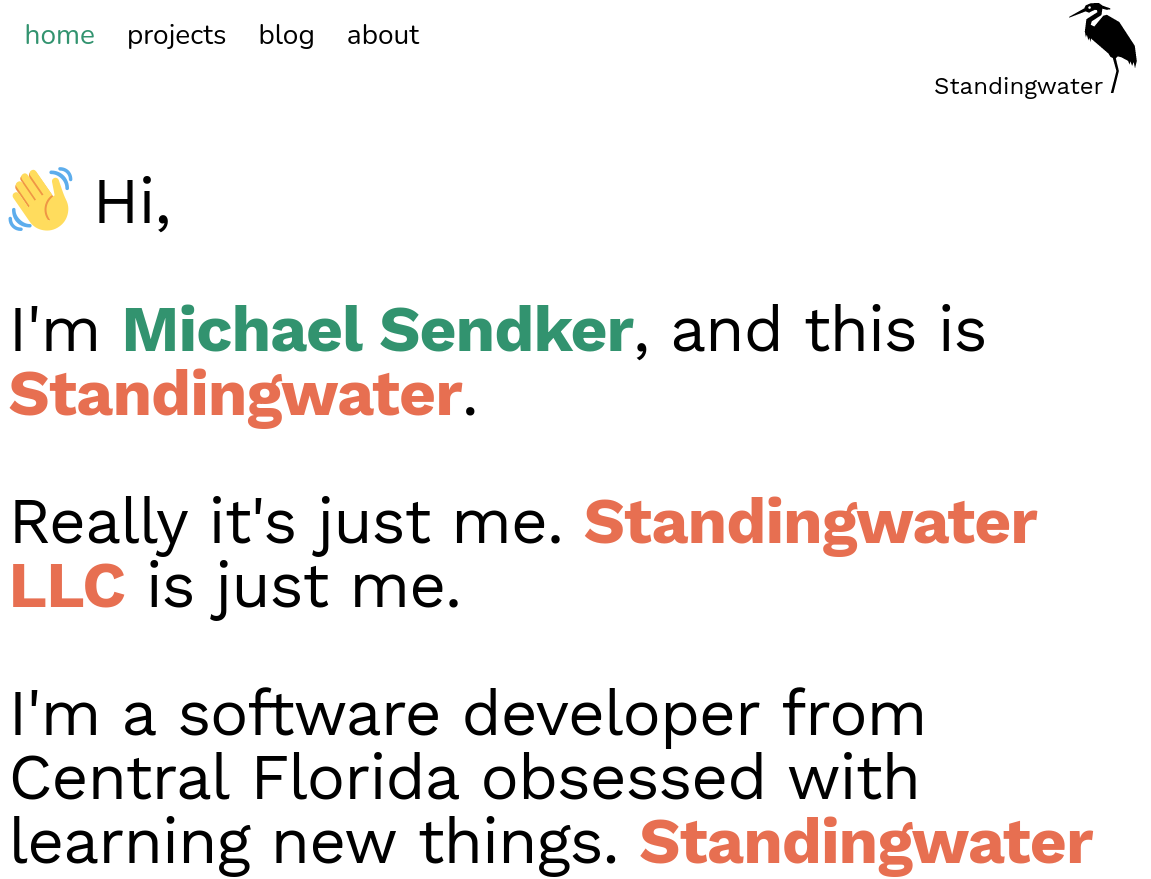
standingwater.io v2

So I got sick of my old website!
The last one (featured in this list as "standingwater.io & blog.standingwater.io" was using the old Gatsby v2 and a starter template from HTML5Up. I decided I wanted a fresh start.
I had a conversation with my boss about style design in which he said his company aims to keep things professional, sleek, and modern, and that that's the image his company strives for. In the context he was poopooing bright colors. My first thought was "then why does your website look like it was designed in 2005?"
So I made this site in Gatsby, from scratch, to be playful and colorful, and I love it.
I took a lot of inspiration from pages on onepagelove.com. I'm still tweaking it, I want more animation, I'd like some url mangling on the projects page so people can deeplink to different filters, but mostly, I like how it turned out, a lot.
There's something about the style, the yellows and round edges and drop shadows, that really reminds me of some educational game I played when I was a kid that I just can't recall now. Perhaps it's this: the Speak & Spell, but I remember an interface that looked like this.
Also, I finally got to include that image of palmettos I've always liked into the home page.